OVERVIEW
This project was assigned in my Special Topics in Art class in my Junior Spring Semester. We were tasked to make type sheets showcasing the fonts of our choice. Two sheets in color and two sheets in black and white. In my approach, I tried to capture the feelings I got from each font.
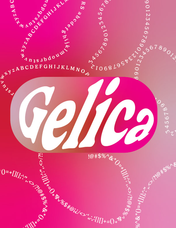
Gelica: The first word that came to mind was jelly! The font itself is also thick and curved. I added the jelly-like feeling I got from the font into the color scheme and focused on showcasing the width of the lettering.
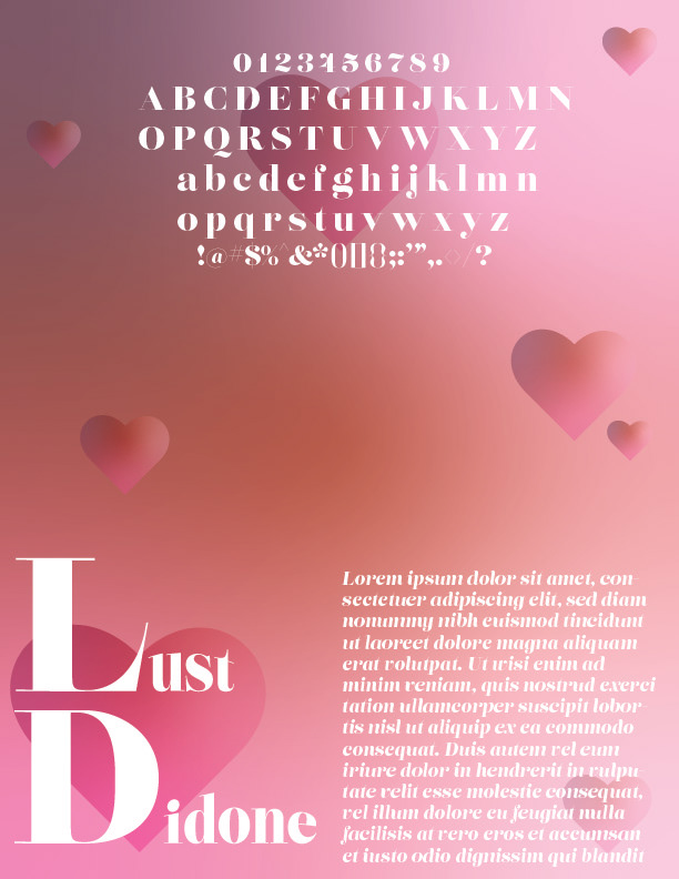
Lust Didone: This sheet was inspired by the word "Lust" in the name of the font. I added hearts and a pink gradient color to the background as I aimed to capture the swell of a heart.
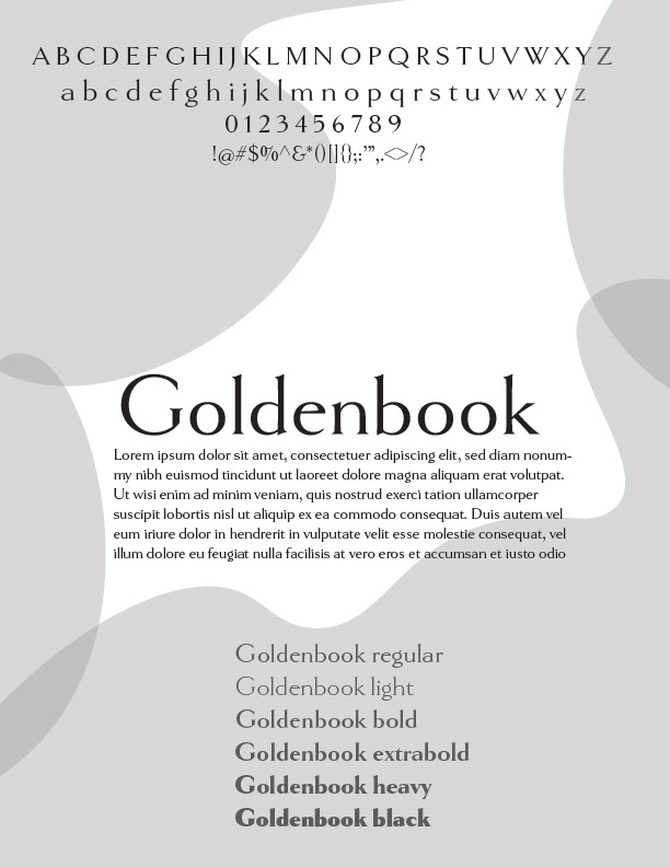
Goldenbook: With this font, I wanted to keep a light concept throughout the composition. I let the color be a light grey and the shapes curved to keep that light feeling.
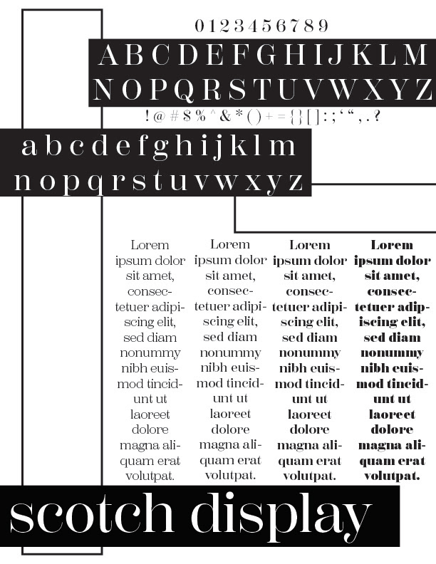
Scotch Display: This font held an air of sophistication to me at first glance. I was inspired by the shape of a rectangle and added that throughout the sheet in a contemporary style.

